UPDATE – July 17, 2020: . This is a text-book case of misinformation (wrong information shared accidentally). Not disinformation (wrong information shared deliberately).
ORIGINAL POST:
(Note: Please see the response from 3M’s India marketing head on this, at the end of this post)
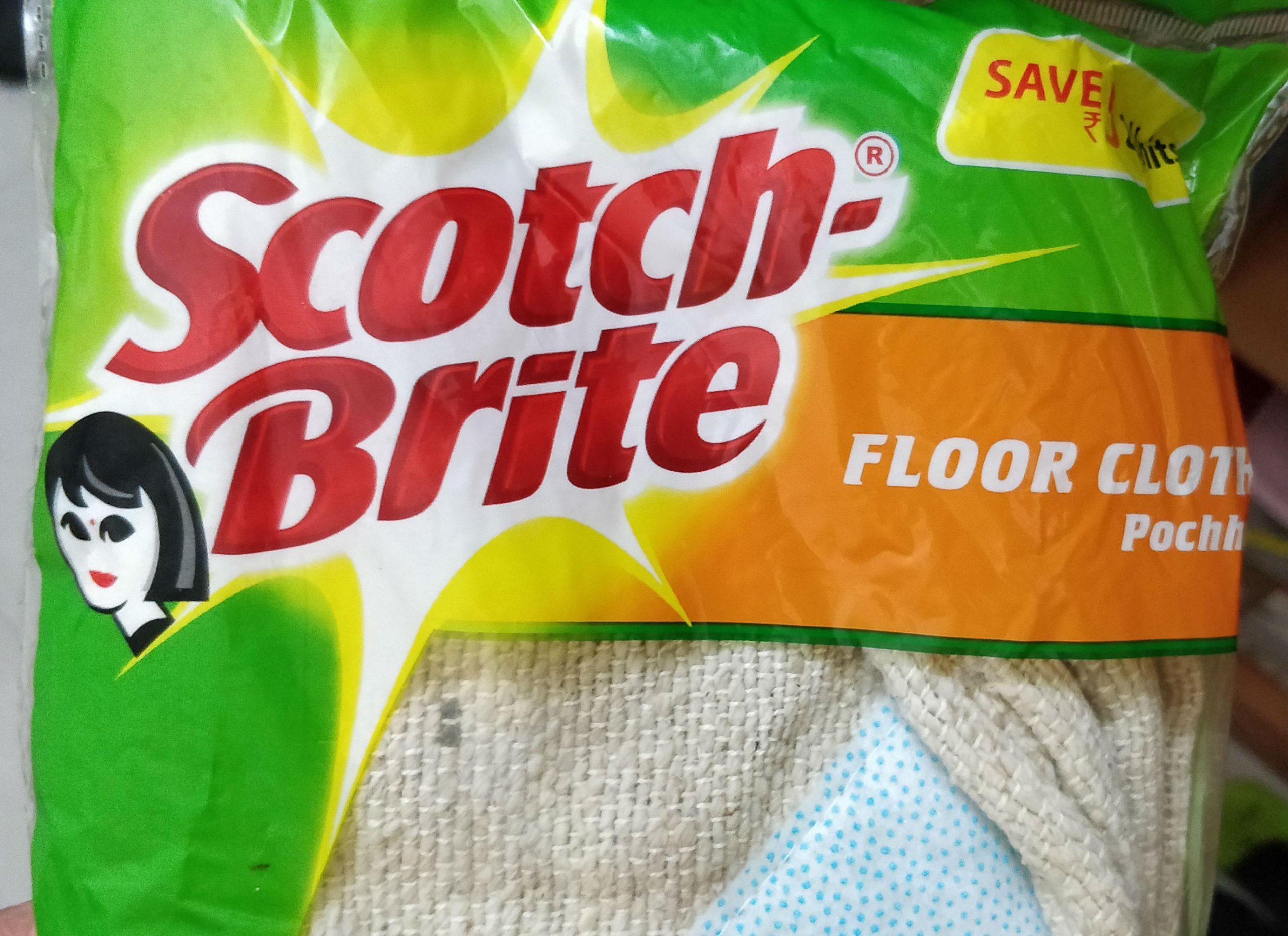
recently shared with me a photo of a pack of Scotch-Brite and after I noticed what she pointed to, I couldn’t unsee it!
The largely familiar logo had the vector image of a woman with a bindi alongside (why ‘bindi’? There is a strong reason, from how the logo unit evolved, from outside India, to India in the 90s – now it exists only in India but not outside the country. See more, below.)! I rushed to our shelf where we keep such items and checked. Yes, there it is!


I did a double-take and wondered if all products from Scotch-Brite have this logo!
And it seems to be the case! But with exceptions!
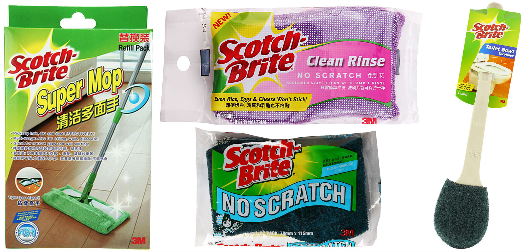
So, while a lint roller does not carry this visual addition, other products like scrub pad/sponge, sink brush, broom, bathroom wipe, stainless steel scrub, toilet brush, spin mop, among others, do carry it right alongside the logo. In fact, it is part of the logo unit!


Now, Scotch-Brite products are enormously useful and are made with incredible quality (we buy them all the time). I love the 3M brand too, for their overall ingenuity and innovation. And I haven’t noticed this tiny addition to their logo unit for select products until it was pointed out to me.
But now, as I mentioned earlier, I could not unsee it.
It does look like this addition is indicative of 3M’s assumptions of who is likely to, or supposed to use the product. Is that ‘a woman’, or the kaam waali bai? Whoever it is, the gender marker is clear when you see that the lint roller, which has a man’s coat in the product pack, doesn’t have it!
I searched for the product range of Scotch-Brite from a few other countries, like Singapore and Malaysia, for the sake of comparison. Many products don’t have this addition, and some of them have non-logo gender cues, like the industrial ‘professional’ scrubber showing a male chef, or the cartoon girl child (looking like the Amul mascot) depicted in the stainless steel ball. But none of them have an integrated logo-level addition.


While searching for the logo’s history (there wasn’t any that I could find), I also found 2 other logos of Scotch-Brite on logo websites that may or may not be older, official versions of the brand’s logo. But what was interesting about them was that they had this vector addition without the bindi/dot, that differentiates it as ‘Indian’. The first one seems like a ‘Western’ woman, while the 2nd one is closer to what we currently see in the Indian version of the logo, but with the Bindi.

That 3M created a uniquely India-specific logo in the 90s (when the Scotch-Brite brand was launched here) is because they thought the ‘bindi’ adds to instant relatability among Indian women/buyers (at that point in time). They had non-bindi women outside India in their logo. (now, if you see the marketing head’s response below, the brand sees the overall idea of tying the product range only to women as a regressive thought. It may have seen as appropriate in the 90s, but in 2020, it seems regressive. Also consider the fact that they have showcased their products’ usage in a gender-neutral way in their ads – also referenced in the response by the marketing head).

When 3M launched Scotch-Brite in India in 1990, the period was very different and I understand if the brand and the agency conceived this addition as a ‘helpful’ marker to indicate user-centric cues. And since it has become a logo unit, they may have imbibed it as a legacy visual and forgotten all about it.
But, in 2020, such gender markers seem awkward and out of place.
I sure hope the good folks at 3M take note of this legacy logo and update it.
3M’s India marketing head .

