
How many times, and how many different ways can the same creative idea be used… or re-used? That would perhaps depend on how many different client-centric interpretations the respective ad agencies can tweak the idea into!
Here is a demonstration of the same core idea being tweaked to suit assorted products and services, while ensuring that all of them are able to grab our attention.
The creative idea is simply this: use our familiarity with the predictable layout of a print publication (like a newspaper, or a telephone directory) that has columns of text, and break the flow by increasing the empty space intentionally to grab our attention.
Here’s a good example – the first I have come across in terms of the idea’s usage.
I couldn’t find the agency, but Gillette’s February 2006 ad is simple and efficient – it shaves off an entire column of text, but notice that it starts way above the column, and shaves the top part of the newspaper too, including the name of the newspaper!

Then, here is a December 2006 print ad in the classified section of a Brazilian newspaper, by the agency Salles Chemistri, Sao Paulo. The client is General Motors, for the car brand Zafira. What the agency did was simple – they used the classified section where people are advertising their used cars for sale and broke the predictable flow of text and columns by buying a slightly larger box worth of space and using it very sparingly. They had just 2 lines of text in that big box – it said,
Zafira 2.0.
More room on the inside.

In terms of the target audience, it seems good enough – the readers of this page are looking for a car. I do wonder if the people who are only looking for relatively cheaper second-hand cars can be convinced to look for a costlier first-hand/new car, but let me pause that thought. The idea does grab attention because it breaks the flow effortlessly – in fact, the ad calls attention to itself instantly!
Then, a year later, Leo Burnett, Brazil used the very same idea (most probably inspired by the Zafira ad, considering both were in Brazil?) for a completely different client. The Zafira ad used the empty space to call out the car’s roomy interior. This ad is for Oral-B mouthwash, while the idea remains the same – buy a larger box in a page (in a telephone directory where people are looking for other people) filled with orderly columns and use that empty sparingly to call it out in the service of an appropriate client.
What did they do? They added a name, address, and a phone number in that big box, and left it looking roomier than normal, for a reason. There’s a sticker’ish call out for Oral-B (with ‘against bad breath’) written on top at the bottom of the page.

So, we moved from a car’s roomy interior to bad breath pushing people away, for the same creative idea!
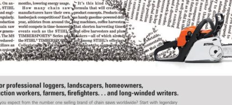
And then, the idea moves to the USA! In 2009, the Boston-based agency Winsper used the same creative thought for Stihl, a German manufacturer of chainsaws and other handheld power equipment including trimmers and blowers. The agency imagined what would happen if the client’s chainsaw, grass trimmer, and blower were to interact with the copy on the newspaper! The result is an attention-grabbing series where the text in the newspaper gets blown away, gets trimmed, and gets cut, literally!


The headline at the bottom too is mildly relevant to the textual violence depicted above. The one that ends with ‘… and long-winded writers’ (for the chainsaw), in particular!
What next, after a spacious car, mouthwash, and chainsaw-trimmer-blower?
Alzheimer’s disease!
Alzheimer’s disease is a progressive disease that destroys memory. So, how can this creative idea be used for an NGO that wants to bring attention to the disease? By blowing away the text as a way to indicate fading memory! This is a 2010 campaign from Belgium, by Publicis, Brussels.

In 2011, we come back to bad breath again 🙂
Heinz used what Oral-B had earlier used in the Netherlands, via the agency N=5.
Instead of talking about a solution to bad breath, Heinz focused on the cause of strong, pungent breath, for their extra strong garlic sauce! The idea remains the same, though with a slightly different interpretation in terms of visual design – a lot more space around the product! And where do they place this ad? In a personals ad section of the newspaper… where it makes most sense!

So, the same creative thought, but used in so many different ways and each one apt for the product/service being sold. And all of them instantly grab attention because they are out of the symmetry that we expect from the print medium’s predictable columns and text!