I’m not a regular consumer of chocolates, but I’m most definitely interested in the business of marketing chocolates. In the process of that interest, I do try and sample most new products in the market. When I recently read that Cadbury’s is expanding its Fuse range to the ‘snack bar’ category (with allusions to ‘healthy’), I was sufficiently curious and interested.
During my rare neighborhood store visit recently (MK Retail, on a weekday afternoon, when there are least likely to be any more than 3-4 people in the store; to be safe), even as I was not looking for it specifically, the Cadbury’s Fuse Fit stood out in the crowded chocolates and snack bar shelf!
There was no point-of-purchase display to announce the product’s availability. So, why did it stand out? It was the packaging!
Take a look.

What do you observe?
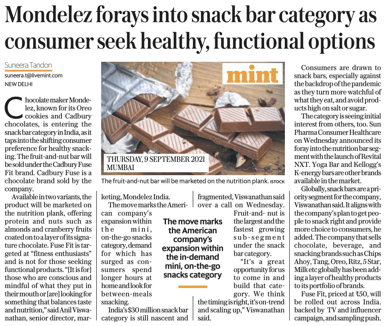
Here are many other popular snackbars that adorn the same shelves usually, for context.

If I’m not mistaken, Cadbury’s Fuse Fit is the first, and the only brand within both the branded chocolates and branded snackbar categories to have a transparent (see-through) cover (at least most of the top part)! And this could be Cadbury’s first product within the chocolate category to have a see-through pack.
Why is this significant?
Because Cadbury’s is entering the ‘healthy’ segment (perhaps) for the first time, they need a significant differentiator to get people to try the product. The consumers should not assume it to be one more chocolate bar from Cadbury’s since that’s what the brand is best known for. This is all the more important because the ‘Fuse’ brand name is already associated with a nuts-filled chocolate bar. So, one potential question in people’s minds could be, ‘Fuse already is filled with nuts… how much more healthy could the Fit be anyway?’.
The see-through package design helps address this question intelligently.
To be sure, it is not fully see-through. The parts that are visible are only the nuts, the so-called healthy addition (a significant part of the bar), while the thin chocolate layer in the bottom is barely visible and is covered by a band at the bottom of the pack (you can still try and see it if you turn the pack in a particular angle).
Here is a full pack and a half-eaten pack, for context 🙂
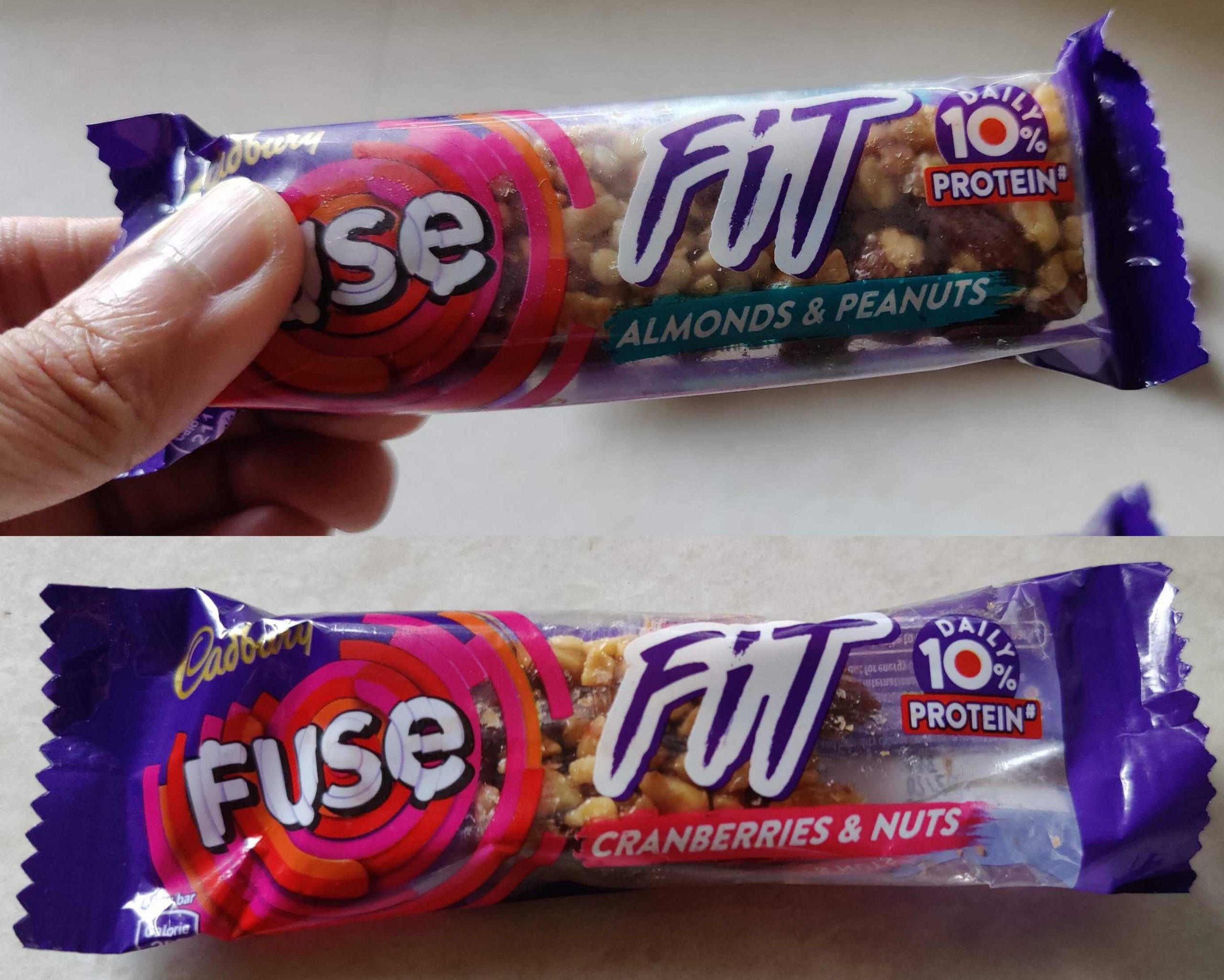
And here is a photo of the actual bar inside.

The see-through pack idea is quite clever, almost like opening up your cards for accentuating trust in the product. Like Cadbury’s is saying, ‘Here, this is what we have in this new bar, take a look at it yourself even before you buy it!’.
This may not be useful for actual chocolate bars since they may tend to look a bit mangled if the packs have been poorly refrigerated, and most of them also have more layers covering the actual product (like a silver foil and a paper wrapper too). But when Fuse is showing only the nuts layer, the amount of transparency is cleverly controlled in service of the new product’s positioning. In a way, the package design communicates something specific about the product.
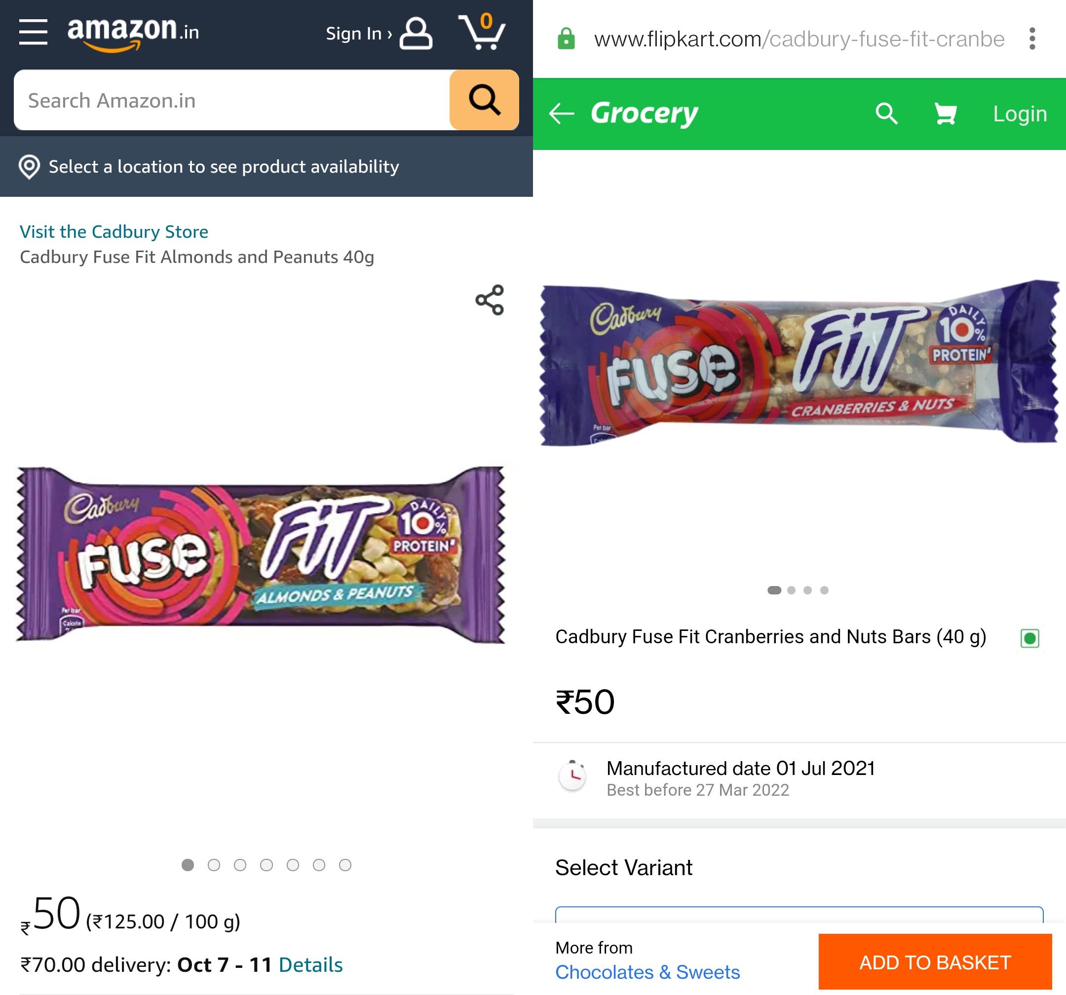
After noticing this see-through pack, I checked the other leading snackbar brands in India online. No other brand has a fully/partly see-through pack! Even the Fuse Fit’s online listing on Amazon has a digital rendition of the pack that does not demonstrate the see-through pack as well as what you see in the store, or with the bar in your hand. Flipkart’s listing is an actual photo, however… and not the Amazon-style digital image.
When you see the thick layer of nuts with your own eyes, it becomes easier to pick it up for a trial.
Imagine if this was an opaque pack design like any other chocolate or snackbar. One, you’d need to trust Cadbury when it says this is different from the normal Fuse and have no other way to find it for yourself barring buying a pack. Two, it would look like any other chocolate or snackbar on the shelf, hardly standing out in any other manner.
Or, Mondelez would need to showcase the actual bar in its marketing communications and advertising, but this comes with its own pitfalls since most people are skeptical about what’s shown in advertisements anyway. The see-through pack is a fantastic point-of-sale idea to induce trials since it advertises the variant’s USP so tangibly.
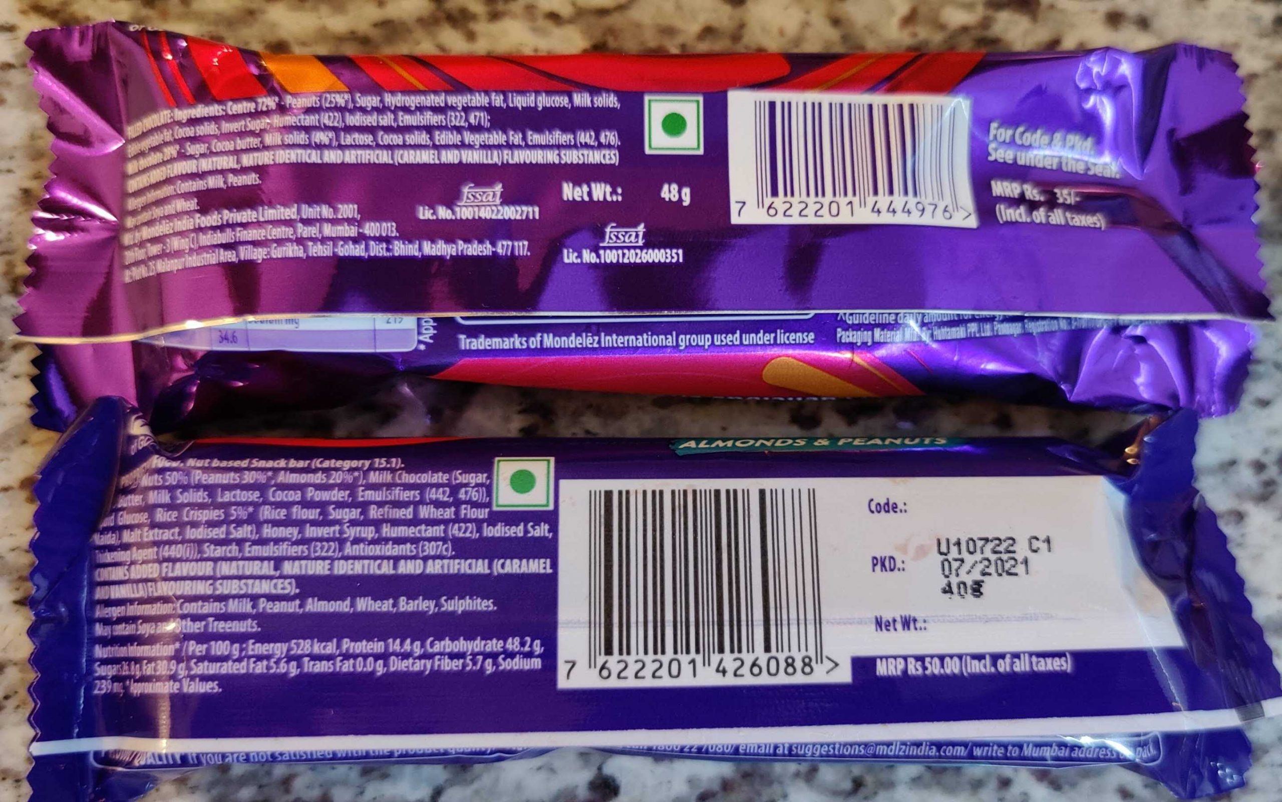
PS 1: Of course, the usual caveats about packaged chocolates being unhealthy, the sugar content in them, and the need to consume them in moderation apply. Here is the back of the pack, along with a normal Fuse bar, just for your reference.
PS 2: In case you are wondering about the last line in the Livemint article (“Fuse Fit, priced at ?50, will be rolled out across India, backed by TV and influencer campaign, and sampling push.“), this is NOT a paid/co-branded post. I don’t do paid/collab posts at all.
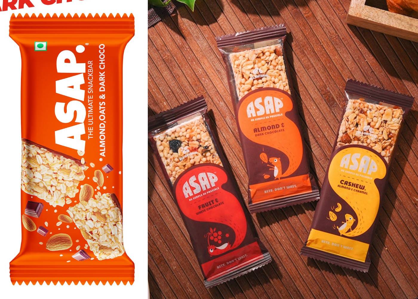
PS 3: As pointed out by Pradeep Damle in a LinkedIn comment, it looks like ASAP, a brand of granola bar tried the semi-see-through packing when they launched (designed by Elephant, the design agency). However, they seem to have stopped using that pack and are now using an opaque pack design.