

I recently stumbled on a couple of eye-catchy packaging designs.
Here’s the package design for Happy Plugs.

And for Trident gum.
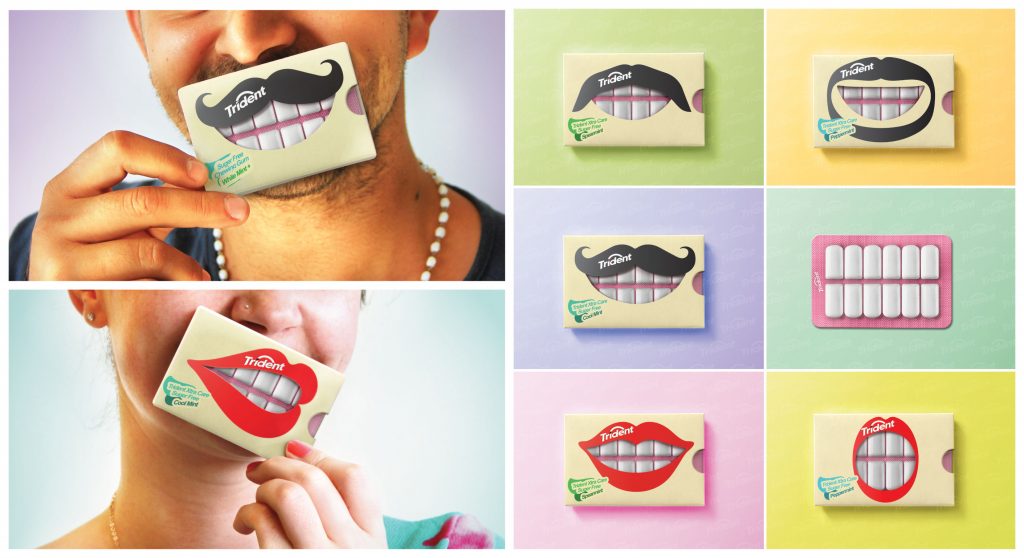
The connecting thread between both is that the packaging creativity is intrinsic to the product’s category – earplugs are associated with music and hence, the use of musical notation design makes wonderfully contextual sense. Similarly, chewing gum is associated with the mouth and teeth, so it makes sense to showcase that in the packaging.
But here is Good Hair Day Bio Pasta, from Greenomic.
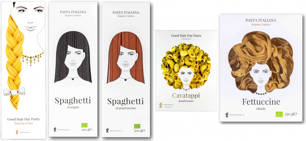
Incredibly beautiful and attractive packaging, no doubt; something that may stop you in your tracks in a store and make you pick it up in awe. But, besides the brand name, there is no link between hair and pasta!
Ditto for the tea bags from Charmvilla.

The goldfish product design looks extremely attractive, and could even make for an interesting usage experience, though you could argue that there is no connect between tea and fish. It’s a fantastic gimmick, at best. And if the gimmick encourages product usage, then so be it.
But this Cava Blossom Wine packaging gets the context aptly too. You buy wine to also gift to others. And when the bottle is designed like a flower bouquet, the gifting attains a more memorable association!
