
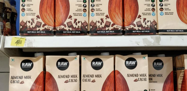
I stumbled on RAW Pressery’s Almond Milk at a Star Bazaar near home recently. Now, I have no specific interest in almond milk but do know (registered in the back of my mind) about the range they have – unsweetened almond milk, almond milk coffee and almond milk cacao. (that coffee thing is interesting; I might just try it out someday).
But what made me stop in my tracks that day was the package design! They are stacking two packs together to form a full almond!
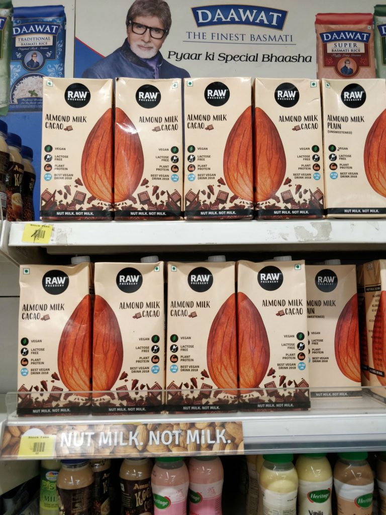
My first thought was – they may have printed half an almond on both sides of the pack, so that this sort of symmetry is made possible at the store level display.
So I went to this shelf and picked up a pack to see the other side. But nope – the other side doesn’t have half an almond, only more product details!
Did they really print 2 designs on their packs, one with half-almond in the right and the other with half-almond in the left… consciously anticipating this possibility at the store level display? If so… whoa! That’s wonderfully specific use of design in product packaging, with a focused purpose! Kudos!