This is a remarkable observation from Dan. The reference is about Salvador’s Dali’s famous painting (the one on top).
There’s a term “ELI5” (Explain Like I’m 5) that was made popular via Reddit where two people attempt to explain difficult concepts to preschoolers.
There is also a very famous book series called ‘Introducing…’ from Icon Books (they have a fantastic collection, many ) that used graphic guides to explain complex concepts like Aesthetics, Anthropology, Capitalism, Chomsky, Epigenetics etc.
All through my agency stints, I have attempted to use this for my B2B clients given that the B2B brands seem to think that their stories need to adhere to complex language. I’ve always tried to break them into simpler narratives under the premise that even in B2B scenarios, the people who make buying decisions are humans. It has worked very well for me in many instances of large B2B client mandates.
I have encountered a counter-argument to this line of thought. The simpler/simplest explanation is often considered reductive and assumed that much of the nuance is eschewed for the simpler narrative. I assume that this is a function of the audience it is meant for, and the amount of effort put in the simplification. Simplifying doesn’t need to be oversimplified or flippant. Even to simplify something sensibly, you first need to understand it with all its complexities.
If the audience is potentially the whole world—the Dali example here is a good showcase since you cannot control the kind of audience that watches it in the museum—then a simpler explanation would be apt. And at least going by the , it seems to be that there is a far better connection with the text meant for kids, than the one meant for adults.
Another, more abrasive argument I have heard from some clients, about this approach, is that it insults the intelligence of the audience. That the audience is intelligent enough to understand and appreciate the complex communication, and sending them a simplified communication (in B2B communication, in particular) is a bad idea since it treats them like kids (ELI5!). This is a valid argument, I feel.
But there’s a legitimate use for the simplified version too, even in this case. In the incredibly noisy, content-overdose world we live in now, the get someone’s attention, particularly when you are a brand, and a B2B one at that, it does require a lot of effort. Being visible is never a problem if you throw enough money around, but being noticed is a different thing. Being remembered, even more so. In that case, if you are able to explain the crux of your solution/service through simpler metaphors, that works like a simple, memorable hook that can lead to a more complex, actual set of details. A great example of this is the work we did (while I was at Ogilvy), for IBM. The logic, if I were to explain like you’re 5 (couldn’t resist!) is: “If we (IBM) can do this with cricket, imagine what we can do to your business, and your incredibly diverse data!”. More on campaign.
On a broader note, a practical application of Dan’s observation, that I’m particularly very fond of, happened when I was at Edelman and we had the mandate for Infosys Prize (like the Indian equivalent of Turing Awards, in one way), for that year (2011). That year, people like Raghuram Rajan and Pratap Bhanu Mehta had won the Infosys Prize. The brief for us was that while the media and general audience knew who won and the title of the citation, they did not understand the significance of the award. So how can we do that? This is not a B2B mandate, and if you consider the audience to be media (and the whole world), then this is a B2C effort.
We (my then Edelman colleague, Shahid, and me, in Bangalore) went through the detailed explanations of why each person had won the Infosys Prize and decided to simplify the entire citation that was written for a far more evolved audience. Our aim to make it far more easily accessible to a larger set of people so that they may get at least a rudimentary knowledge of why a person had won. Take an example of the Nobel Prize. The science-related ones – we usually know the name of the winner and the subject of the award. But most people rarely know why a person won an award. That requires knowledge of that subject. What if we are able to simplify that story?
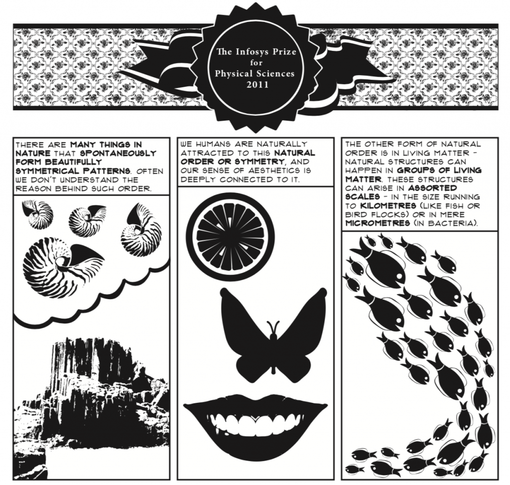
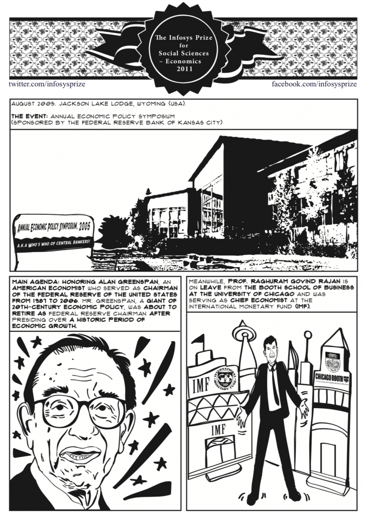
We decided to go with the format of a comic-strip and prepared story-boards for each winner accordingly. Given budget constraints and the lack of an appropriate artist, the art part of the exercise was a bit of a miss (one reason why I joined Ogilvy later; to get the art part of communication right), but I’m still very proud of the overall effort and the script, in particular. We threw in a lot of tiny nuances inside, like the pea soup joke in the one right below (when we knew that Mendel experimented on pea plants a lot), or the use of mobile phone purchase as a gateway to explain Kalyanmoy Deb’s innovization, or the use of the example of stampedes from famous films.
The Infosys Prize team used these as handouts to the media during the announcement in 2011 and the feedback was that the media was able to understand the concepts behind each winner’s achievement significantly better.
Here are the comic-strips we had created back then, within the resources we had. Do see the note on how the Infosys team took on this basic idea and used that as a template for all the awards, for all the years… after these comic-strips.
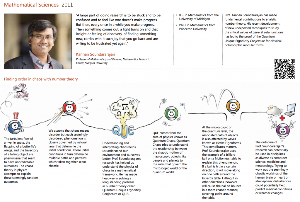
The team behind Infosys Prize eventually used this strategy and created simple narratives for , across years. They have also used a consistent visual style that is far less comic-book and more of a simpler visual aid.


