
I wouldn’t really care to buy Murukku from Haldiram’s considering the plethora of brands available in Bengaluru (including Coimbatore’s own A1 Chips brand murukku, among others like A2B, etc.) but when I stumbled onto a pack online recently by chance, my first reaction was to cringe.
Now, I’m a pretty big fan of Haldiram’s in most forms – their eating joints in Delhi are my regular go-to whenever I’m in Delhi for work. Haldiram’s Moong Dal and Soya Sticks are perennial favorites whenever I’m done with the range from Prakash Namkeen.
And generally, I’m very familiar with Haldiram’s packaging – they are not the ones to really stand out, but they do their job well. So, this new packaging design for the ‘Southern Delights’ range was a not-so-pleasant surprise.
My first thought was, ‘What were they thinking?’. And for that, I didn’t have to wonder much – a simple Google search took me to the thinking behind the design, courtesy Haldiram’s design agency, Itu Chaudhuri Design.
Here is the problem, strategy, and solution, as explained by the agency.
The crux: “cues that North Indians would effortlessly associate with Southern traditions” + “picked up by Southern audiences as a signal meant for them, making sure that this segment was not overlooked”
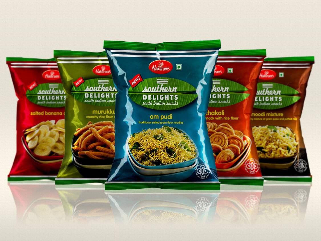
The 3 design cues the agency says it has picked up include,
1. silk saree (for background color)
2. banana leaf (sub-brand logo unit)
3. kolam (for the quality mark unit)
There is a fourth design cue that is present in the design even though the agency’s notes do not mention it. It is the Shivite pattai (Tripundra) that adorns the banana leaf.
Now, to be absolutely fair to the design agency and Haldiram’s, one could argue that the banana leaf, kolam, and silk sarees are perhaps the most commonly associated markers for ‘South’ if you ask ‘North Indians’. I use both ‘South’ and ‘North Indians’ inside quotes for a reason 🙂
If I use ‘North Indian’ as a sweeping phrase, sitting in Bengaluru, and as a Tamilian, most people would be reminded of the oft-used quote, “Everything above the Vindhyas is North for people in the South”.
And when ‘North Indians’ use the sweeping ‘South’ to denote anything below the Vindhyas, the counterpoint manifests itself.
But it’s one thing to use ‘North’ and ‘South’ sweepingly during casual conversations with people we know and completely another thing to use in mainstream media and brand communication.
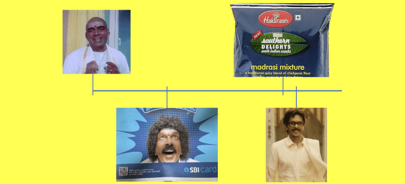
An extreme example of this syndrome is how Hindi cinema caricatured ‘South’ Indians (specifically Tamilians, but that nuance may be lost on most), most famously in Padosan’s Ek Chatur Nar Karke Sringar (1968) where Mehmood was incredibly funny while delivering the said caricature.
Padosan and Mehmood are definitely right up there in terms of extreme caricatures of ‘South’ Indians, but as recently as October 2021, SBI Cards came under fire from ‘South’ Indians for a very similar portrayal, led by Jaaved Jaffrey.
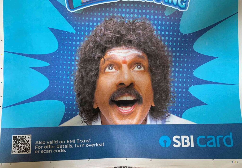
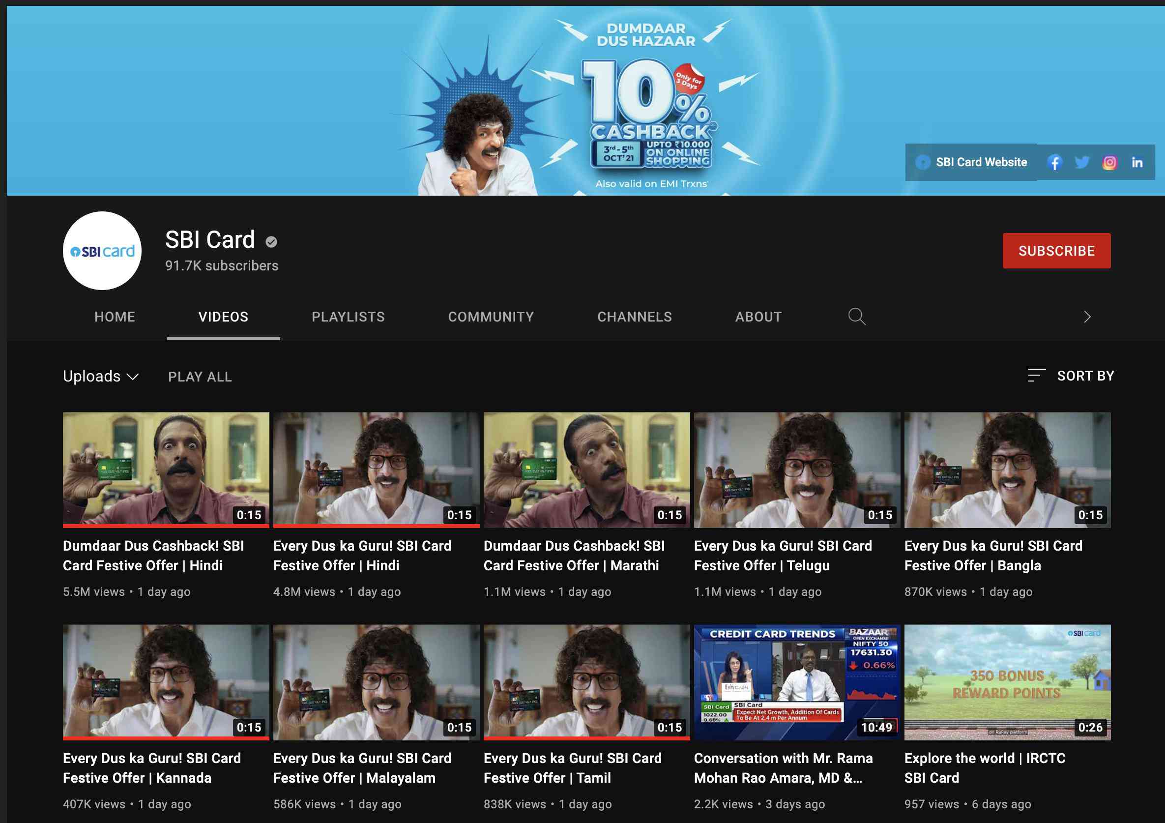
After adequate annoyance was displayed online, SBI Card (agency: Leo Burnett) quietly withdrew the ad campaign.
But as I mentioned earlier, both Padosan and the SBI Card campaign were extreme examples. A far milder example on these lines is Haldiram’s packaging design.
Why?
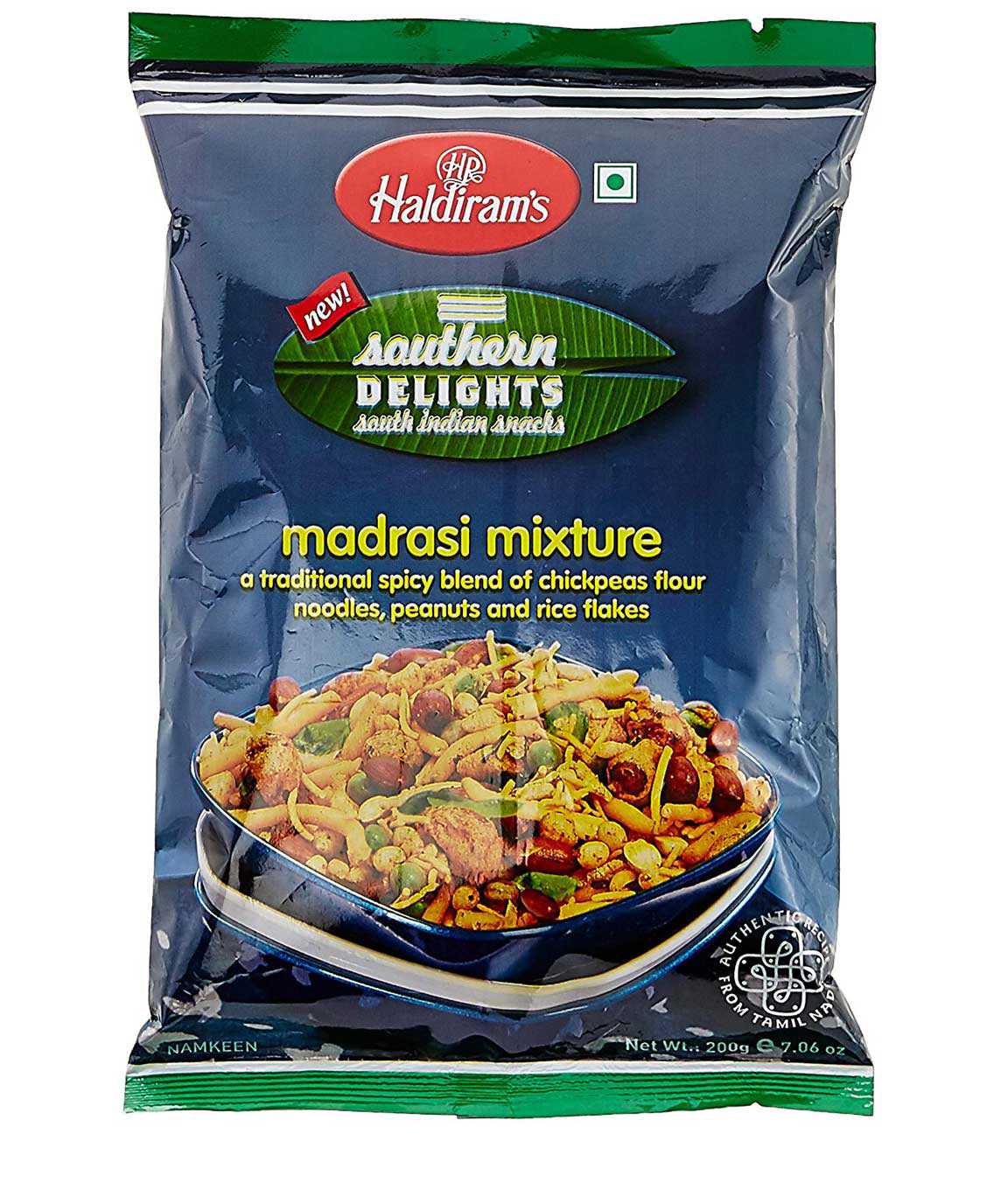
What does the banana leaf have anything to do with snacks like murukku, om pudi, etc. (I’m not even going into the variant called ‘Madrasi Mixture’, a name straight out of Mehmood’s caricature, yet)? The banana leaf is used to eat meals/food, not snacks.
What do sarees and kolam have to do with snacks? Nothing.
What does the pattai/tripundra have anything at all to do with snacks? Nothing at all, again.
I completely understand that these elements have been used as visual cues to depict a geographical location. But the kolam unit says, ‘Authentic recipes from Tamil Nadu’. Tamil Nadu is not the only Southern state – there are 4 more!
The agency’s explanation is, “cues that North Indians would effortlessly associate with Southern traditions”. Fair enough, but they perhaps mean ‘Tamil’ traditions, in this context.
One can assume that Haldiram’s may launch more under this range and include specific namkeens from Andhra Pradesh/Telangana, Kerala, and Karnataka too, but would those have the banana leaf and pattai unit too? And the text in the kolam would merely change ‘Tamil Nadu’ to another state?
Consider the 2nd part of the agency’s logic: “picked up by Southern audiences as a signal meant for them”. For ‘Southern’ (or specifically, Tamil) audiences, these visual cues mean something specific beyond what they could fleetingly mean to ‘North’ Indian users. The saree cue may not even register, but the banana leaf is indicative of a meal, while the pattai has deep religious significance and has no meaningful place in a snack’s pack.
I’d assume that this design effort is primarily to appeal to ‘North’ Indian buyers in the assumption that this is what they reductively associate with ‘South’/’Tamil’. This is entirely understandable IF I buy into the logic that ‘North’ people are as reductive as Haldiram’s/the design agency assumes them to be.
To test the “picked up by Southern audiences as a signal meant for them” logic, you only need to look at how brands from the ‘South’ have designed their ready-to-eat murukku packs! Here’s a sample:
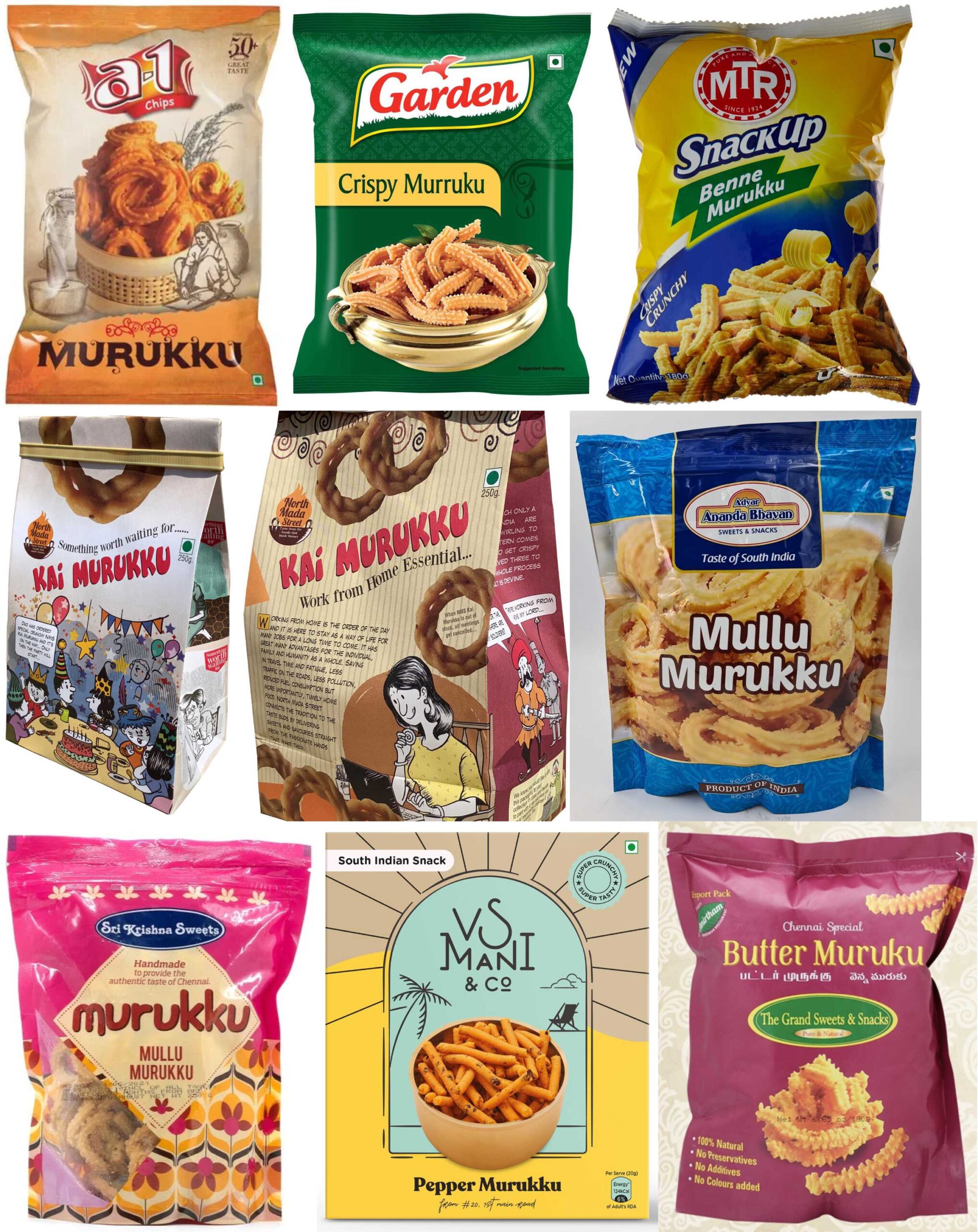
PS: The reason you see the Garden brand in this list is because this Mumbai-based brand was acquired by Chennai-based Cavinkare in 2009.
Even from a limited sample set of popular packaged snack brands, it’s obvious that none of them have any regional markers. This is not very different from Haldiram’s itself not having any regional markers for their ‘North’ Indian snacks, even the ones that have a State or a region’s name prominently mentioned in the pack as part of the item’s name!
So why the effort to appeal to ‘South’ Indians alone? In order to induce authenticity? How can authenticity be gained by using broad strokes like ‘Southern’ in the sub-brand name and producing ‘Tamil Nadu’ snacks alone?
For context, when Hindustan Unilever wanted to launch an Ayurvedic range of skincare products in 2002, it did not merely slap Ayurveda-related imagery into its product packaging. It partnered with Coimbatore’s Arya Vaidya Pharmacy for technical know-how. That lent product-level credibility to HUL to make any Ayurveda-related claim.
Take an example of a product-level update by Haldiram’s: suppose they find a real Tamil chef known for his legacy in making excellent Tamil-style snacks and he happens to be, for instance, an Iyer, this lends itself to a contextual backstory for why the pattai in the pack. To some extent, even the banana leaf and kolam could be meaningfully explained.
Explaining Haldiram’s design logic with, ‘This is perfectly useful to attract the attention of those Delhi’ites who don’t know anything beyond the banana leaf when it comes to South given their interest in Andhra Bhavan south meals’ is as cringeworthy (I cringed while typing it too) and sweepingly reductive as using kolam, banana leaf, and pattai in the packaging for snacks. By the way, I did not isolate ‘Delhi’ for North – Itu Chaudhuri Design’s Haldiram’s work does it (see above): “Southern Delights is a range of classic savouries from the South, introduced by Haldiram’s as to audiences in Delhi and the rest of India”.
Consider the other recent marketing communication I stumbled onto – a national ad campaign for Bausch + Lomb contact lens (incidentally, the contact lens brand I have been using since 1999, and even more incidentally that I just ordered my year’s supply via Lenkskart minutes before writing this post!) called ‘Be a superstar’.
The ad, by the agency Kinnect, has a flunkey with spectacles in the shooting spot imagining himself to be a superstar. But as the goons advance towards him menacingly, he throws his spectacles away to begin fighting and obviously, cannot see anything clearly. So… contact lenses!
But everything about the ad that actually was released before the Pongal/Sankranti season in South Indian languages first (as also a Hindi version) seems like it was made by people who see the ‘South’ outside-in. The music is a cringe-worthy assumption of exaggerated Southern masala movie music tropes. The mannerisms, including the one using the dhoti-piece on the shoulder, the audio effects… everything feels just like a ‘North’ Indian appropriation of ‘South’. Not very different from Chennai Express, for context.
The most obvious giveaway is the basic lack of understanding of the movies they are trying to exaggerate for comic effect. Spectacled ‘South’ heroes have long fought burly goons in many, many films. In fact, K.Bhagyaraj has made it his trademark considering he’s seen in his spectacled avatar in almost all his movies. He is well-known for calmly removing his wristwatch and spectacles, handing it over to a nearby underling or the heroine, whoever is available closest, and then going on to give a sound thrashing to the goons. K.Bhagyaraj was a total superstar in his younger, heydays, incidentally.
To be absolutely clear, I’m not equating Haldiram’s packaging and the Bausch + Lomb contact lens ad campaign with Padosan-level abomination. But they still seem like a poor effort in understanding the nuances of the region they are using/appropriating (secondary, in the case of Haldiram’s, and primary, in the case of Bausch + Lomb).
If I have said all this, it’s only fair I add an ad from a ‘North’ brand that got the ‘South’ nuance right even while exaggerating it for comic effect.
Here goes!